 |
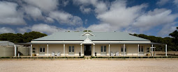
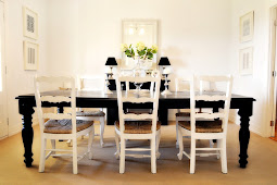
| Image from my home! |
So often when I am asked for design advice I give same answer "keep it simple".
There are so many over designed houses, filled with what is the 'in' or trendy thing at the time.
Why decorate to trends?
Decorate for your taste and your lifestyle, that way everybody won't have the same 'in' product,
print or style that is done to death!
Keep it simple and everything will shine.




.jpg)







11 comments:
Nice work, I am really glad to be 1 of several visitants on this awful site : D
yes, just awful ;D maybe if it was Navy & Cream - oh wait... Navy Cream/Black white same same in my book all equal STUNNING! Love your work White Room!!
Here, here.....'trends' is a truly awful way to decorate! Love you simple and classic style! KG x
Perfection!
So classy and timeless.
Love it!
B
Your style is lovely Letitia xx
Simple, but so beautiful!!
white walls and dark wood is a really great combination
Keep it simple is great advice...
If only people we brave enough to follow their own instinct!!
Love Norralee xx
Very very true.
You are so right, its all about a plan or blue print as I like to call it. Look back at this list/plan/blue print when you are tempted and you will not waste your time or money on trendy things.
The console in your blog looks so right now but could have been done years ago.
The only trend it follows is classic elegance.
Loved you rooms A-M mentioned in today blog.
warm wishes,
Daryl
Fantastic advice. This is so elegant and chic!
it looks good like the details
Post a Comment